Color Explosions:
Color Psychology Drives Creativity and Profit in Textile Designs

Color transcends mere aesthetic choice. It’s a powerful communicator that deeply resonates with consumer emotions and influences market trends. Exploring how colors affect human behavior, emotions, and decision-making, color psychology is an intriguing topic of study that is very useful in design. Designers can leverage the power of color to captivate and engage their audience while also ensuring it aligns with brand messages, enhances user experiences, and creates visually compelling products. Consider the profound impact that color choices have on consumer behavior, engagement, and sales. The right color palette can enhance both the aesthetic and functional effectiveness of your design, ultimately boosting your brand’s profitability. Take a moment to reflect: Is your current color palette effectively communicating with your target audience?

Using the complex psychology of color to boost creativity and profitability, textile design software like NedGraphics gives designers cutting-edge tools to experiment with and optimize color use. In today’s increasingly competitive market, making well-informed color choices is absolutely essential. NedGraphics’ software is designed to support a user’s creative vision by providing advanced design functions, enabling them to explore the digital application of trends and consumer preferences, based on customizable parameters. This empowers designers to not only express their creative abilities but also strategically translate their instinctive visions into successful market outcomes. This results in designs that not only attract but also retain consumer interest, ultimately affecting the bottom line positively. However, knowing you have the best design tools at your fingertips doesn’t always mean you’re effectively leveraging the power of color psychology in your designs, so we’re here to help. 

As your trusted partner in design, we are fully invested in your success. In the following sections of this article, we will explore the fascinating world of color psychology and how it can empower your understanding. Starting with an understanding of color psychology and its significant impact on consumer behavior. We will explore how bold colors can drive profitability by making products stand out in a saturated market. Additionally, we will highlight how using NedGraphics software facilitates remarkable color innovations and supports sustainability in design practices, ensuring that creativity can flourish without compromising environmental responsibilities.  

Join us as we uncover the nuances of color psychology and its application in modern textile design, all through the lens of NedGraphics’ advanced capabilities.

Understanding the Basics of Color Psychology

Color psychology is an essential component of design that taps into the emotional and behavioral responses triggered by different hues. At its core, this discipline examines how color influences our moods and behaviors, making it critical knowledge for designers in any field, but particularly in textile design, where visual impact is paramount. Each color on the spectrum carries its own psychological weight. Different colors hold different symbolic meanings, for instance:

Red

Passion, excitement, and love.

Red’s are often associated with love, passion, and urgency, making it a popular choice in marketing to draw attention and encourage quick decisions.

Blue

Wisdom, hope, reason, and peace.

Blue, on the cooler end of the color spectrum, gives a sense of serenity and dependability, which is why financial institutions and health care providers prefer it to project stability and trust.

Yellow

Hope, joy, and danger

Yellow, with its inherent brightness and warmth, is perceived as cheerful and inviting and is often used to create a sense of optimism and youthfulness. However, yellow is also striking and stands out; give this color a bright enough hue, and it becomes perfect to display eye-catching signage.

“One 2020 study that surveyed the emotional associations of 4,598 people from 30 different countries found that people commonly associate certain colors with specific emotions. According to the study results:

  • Black: 51% of respondents associated black with sadness
  • White: 43% of people associated white with relief
  • Red: 68% associated red with love
  • Blue: 35% linked blue to feelings of relief
  • Green: 39% linked green to contentment
  • Yellow: 52% felt that yellow meant joy
  • Purple: 25% reported they associated purple with pleasure
  • Brown: 36% linked brown to disgust
  • Orange: 44% associated orange with joy
  • Pink: 50% linked pink with love

The study’s researchers suggested that such results indicated that color-emotion associations appear to have universal qualities. These shared meanings may play an essential role in aiding communication.”1 

There is a wealth of research available on the fascinating topic of color psychology, far more than we can cover in this article. In order to further explore this topic, we encourage you to keep researching and join us on social media to continue the conversation with any new findings you come across!

The Impact of Vibrant, Bold Colors in Capturing Consumer Attention

Vibrant, bold colors are great when it comes to capturing consumer attention and differentiating products in the competitive textile market. These colors make a strong visual statement that can instantly draw the eye, making them perfect for standing out on crowded shelves or in digital marketplaces. Bold colors convey a sense of confidence and vitality, appealing to consumers’ emotional responses and encouraging them to associate these positive feelings with the brand or product

The use of bright, saturated colors can also serve as a distinguishing feature, setting a brand apart from its competitors. For instance, a fashion line that consistently uses a unique color palette can become instantly recognizable, fostering brand loyalty and enhancing consumer recall. In a market where consumers are bombarded with choices, having a distinct color identity helps keep a brand at the forefront of consumer minds. Can you think of any brands in particular? We know we can think of a few.

Profitable and Popular Colors in the Textile Industry

Some colors have proven historically profitable and remain popular in the textile industry due to their wide appeal and versatility. Here are a few examples:

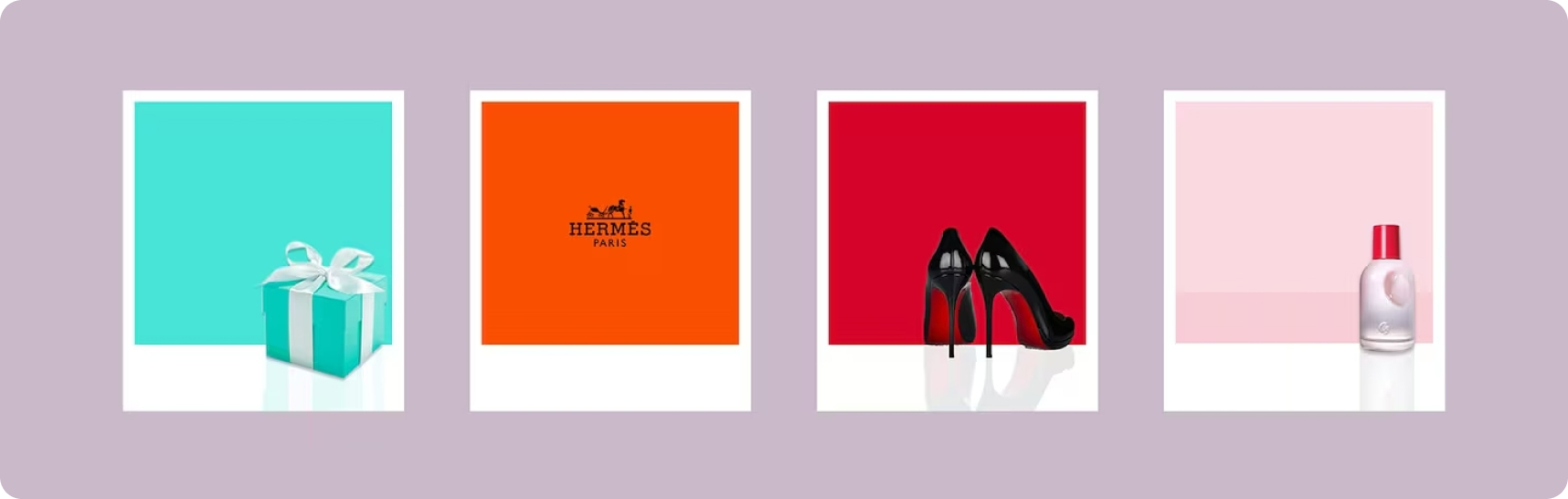
Red: Often used to evoke excitement and passion, red is a powerful color that can stimulate feelings of urgency and desire. It's frequently seen in activewear and evening wear, where it commands attention and exudes a strong presence. For home textiles, “red is a color that raises a room’s energy. Muted shades can pique feelings of love, passion, and sensuality, while bright hues may trigger anger, strength, and power. It's a warm, generally positive, motivating color that encourages people to act and gives shy, soft-spoken folks more confidence.” 2

Blue: Known for its trustworthiness and calming effect, blue is incredibly versatile and widely used in everything from corporate wear to casual jeans. Its popularity also extends to home textiles, such as bed linens and curtains, due to its serene connotations. Blue is a color that never goes out of style. From royal blue, which is often used for uniforms and formal attire and symbolizes trust, authority, and security, to navy blue, which stands for professionalism, dependability, and serenity.

Black: A staple in fashion, black signifies sophistication and luxury. Say it with us; it’s a timeless choice and probably a staple in your very own wardrobe. It is a common choice for high-end products as it evokes a sense of exclusivity and elegance, making it perennially popular across various textile applications.

White: White represents purity, cleanliness, and simplicity. Its versatility is used in so many ways and has always been a popular choice for clothing, linens, and home decor.

What about Neon Colors? In recent years, neon shades have surged in popularity, particularly in sportswear and youthful fashion trends. These bright colors not only stand out visually but also align with modern themes of boldness and individual expression. These shades are a lot of fun to incorporate into brands due to their vibrancy. “Andy Warhol, who entered the world of art in the late 1940s, described neon as ‘one of the great modern things’.” 3

These colors have demonstrated their ability to attract consumers and influence purchase decisions, making them valuable assets in a designer’s toolkit. By strategically implementing these proven hues, textile designers can tap into established consumer preferences and market trends to maximize profitability and market impact.

So What’s Next? Exploring Complex Color Combinations with NedGraphics

NedGraphics software is a great tool for designers looking to explore and integrate complex color combinations into both traditional and modern patterns. Our software’s advanced color-matching features and extensive color libraries allow designers to experiment with a wide range of hues, ensuring precision and consistency across different fabrics and prints. With NedGraphics, designers can simulate how specific colors interact under various lighting conditions, helping to predict how materials will look in real-world applications. This capability is crucial when working with complex patterns that require a harmonious blend of colors to maintain their aesthetic appeal.

Furthermore, NedGraphics enables the seamless integration of color trends into design workflows by allowing designers to import color palettes from leading trend forecasting services, like Pantone, directly into the software. This integration ensures that the color choices are not only innovative but also market-relevant. Designers can also create custom palettes that reflect their unique vision, combining traditional motifs with modern hues to produce textiles that are both contemporary and culturally resonant.

Enhancing Creativity and Innovation through Color

NedGraphics is equipped with several advanced features that greatly enhance color experimentation and application in textile design, notably through its color matching and real-time simulation capabilities:

Color Matching with Easy Coloring Premium: NedGraphics provides highly accurate color matching tools that are essential for designers to replicate colors precisely in their digital designs. This feature is invaluable for ensuring that colors translate correctly into real-world applications across various fabric types. Beyond basic color matching, a standout feature of this program is its ability to create color variations suitable for any design intended for print, knits, wovens, wallcoverings, or floorcoverings. Additionally, the software supports color calibration, which is vital for maintaining consistency in color across different production batches and systems, such as Pantone. This ensures that designers’ choices remain consistent across different production batches.

Recolor simulations instantly with True Coloring: This feature allows designers to see how colors and textures will look on different fabrics before they go into production. By automatically changing the colors of the fabrics or tile layout simulations, designers can accelerate decision making by effortlessly presenting multiple color options in real time. This tool helps in making informed decisions about color combinations and fabric choices, reducing the risk of costly errors in the final product.

NedGraphics Color Utilities for Adobe® Illustrator®: An integral part of maintaining color consistency and collaboration, Color Utilities help keep colors, patterns, and seasonal palette data organized for design teams. Supporting standard Adobe® formats, these color palettes can be shared easily with vendors or brand owners. Additionally, the Color Range feature within Adobe® Illustrator® enables users to adjust colors on the fly to match the printed result accurately. When a color or palette changes, designers receive updates automatically, in real time, directly in Adobe® Illustrator®, ensuring seamless integration and up-to-date color accuracy throughout the design process.

These three highlighted features collectively support a dynamic and innovative design environment where color precision meets creative vision, facilitating a workflow that is both efficient and inspired.

Tips for Designers Using NedGraphics for Vivid and Accurate Color Results

For designers aiming to achieve the most accurate and vivid color results in their textile designs using NedGraphics, here are some practical tips: 

  • Leverage the Calibration Tools: Ensure that all devices — from monitors to printers — are properly calibrated. NedGraphics’ calibration tools can help synchronize color outputs across different devices, which is crucial for maintaining color accuracy from digital design to physical fabric. Read more about our color calibration expert, Marnix.


  • Experiment with Color Layers: Use NedGraphics Design and Repeat to experiment with different color layers and overlaps. This can reveal new and unique color interactions that might not be apparent in a traditional design setting. 


  • Reduce & Separate the Number of Colors: Managing the transition from the myriad of colors captured in image scans to a precise number of flat and tonal colors is a significant challenge. NedGraphics Color Reduction & Cleaning tool greatly simplifies this process by applying optimized color reduction techniques tailored to the type of design. This ensures that you achieve desired results efficiently and accurately, helping to streamline the production process and reduce time-to-market.

Shared Planet, Shared Responsibility: Balancing Bold Color Use Sustainably

Employing bold colors in textile design often raises environmental concerns, particularly regarding the impact of dyes and their disposal. To balance vibrant color use with sustainability, designers can adopt several eco-friendly practices. 

Opting for eco-friendly dyes that are low-impact and have a reduced environmental footprint is crucial; these dyes require less water and energy to produce and release fewer chemicals, so be sure to check where you’re manufacturing your textiles. 

Additionally, using precise color matching tools helps minimize waste by reducing the need for re-dyeing, conserving resources, and decreasing chemical waste. Implementing more controlled and precise dyeing processes, such as digital printing and dye sublimation, also significantly cuts down on dye and water usage compared to traditional methods, enhancing sustainability without compromising on color quality.

How NedGraphics Supports Sustainable Design Practices

NedGraphics software robustly supports sustainable design practices without compromising on color quality through several innovative features. It provides advanced color management tools and services that maintain color consistency across different fabrics and textures, reducing waste by ensuring colors are accurate from the start, thus minimizing the need for reworking and overproduction.

Our software’s ability to simulate various fabrics and their interaction with colors allows designers to forgo physical samples, decreasing the environmental impact associated with traditional sample production. Additionally, NedGraphics integrates with eco-friendly workflows, allowing the use of eco-certified colors and materials that adhere to environmental guidelines while achieving desired aesthetics. Its 3D simulation features also reduce the need for physical samples, cutting down the carbon footprint linked with sample production and transportation.

By utilizing NedGraphics, designers can effectively blend creativity with sustainability, enhancing both the visual appeal and environmental integrity of textile products and positioning their brands as responsible leaders in the competitive market.

Ready to Master Color Psychology in Your Future Textile Designs?

The principles of color psychology serve as a guide for the strategic use of color, which is crucial for promoting creativity and profitability. By deeply understanding how colors influence consumer behavior and preferences, you can craft products that not only appeal visually but also resonate emotionally, leading to greater market success. 

NedGraphics isn’t just software; it’s a vital tool for textile designers who want to push the boundaries of color. Our advanced features for color management, real-time simulation, and integrated sustainability tools empower you to experiment boldly and innovate responsibly. Don’t settle for good enough; create designs that are both aesthetically stunning and environmentally conscious. Contact us today to schedule a demo and see how NedGraphics can elevate your next project! 

As we continue to explore new technologies and deepen our understanding of color psychology, emerging trends are likely to focus on hyper-personalization and sustainability. These trends will challenge designers to think differently about how colors can be used to tell stories, evoke emotions, and reflect individual identities in an eco-friendly way. For those ready to lead in this colorful future, embracing tools like NedGraphics will be key to turning visionary ideas into tangible successes that shape the textile industry’s next chapter. 

Don’t miss out! Follow us on LinkedIn, YouTube, Facebook, and Instagram for exclusive content to help inspire your creativity!

Your NedGraphics Team

References

1. Kendra Cherry, Mse. (2024, February 20). Can color really influence your mood and behavior? here’s what to know. Verywell Mind. https://www.verywellmind.com/color-psychology-2795824 
2. How do colors in my home change my mood? color psychology explained. Mental Health America. (n.d.). https://mhanational.org/surroundings/color-psychology-explained 
3. Silbert, V. (2024, March 1). How to use neon or fluorescent colors in branding & design. Silber Consulting.

Sign Up

Training & Support Inquiries